Wednesday, October 30, 2013

"GEAR UP FOR SWEATER WEATHER"


This American Eagle is located at Eastland Mall in Bloomington, IL.  These are one of the better windows I have seen!  They embody their brand and capture the theme and message to a T.  They grab peoples attention with SALE signage and a theme relatable to EVERYONE this time of year.  They use repetition with there flannel shirts and rhythm and balance with seven shirts in a row.  The background of one of the big windows is a mountain theme which is not only beautiful but draws ones attention.  They stayed consistent with their brand and theme and they understand their target market completely.  Not only will a teenager be attracted to the up to date clothing here but the parent's will also appreciate the SALE signage and keeping their children warm through the winter time!  Altogether great job!

"COMMAND ATTENTION"


This Express location is found in Bloomington at Eastland Mall.  There window is small yet bold.  It is a military inspired window that does command my attention.  The outfits go with the theme and make me want to buy it.  Even the mannequins they chose are commanding and powerful.  It is more of a modern twist to military attire.  There is balance on each side with a simple grey sign centered in the middle.  The only thing I would have done differently was the background because it loses a little focus on the actual "modern military" attire.  Overall, cute and creative window at Express!

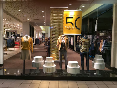
"50 YEARS OF STYLE"


The Limited is located at Eastland Mall in Bloomington, IL.  I really enjoyed this window.  The style is very simplistic and sophisticated which represents their store well.  The use of golds in the signage, back drop, and clothing symbolizes an elite and powerful store (Why they've been here for 50 yrs).  Altogether it is very united and balanced.  I like how you can see into the store and what they have to offer instead of a wall of fabric.  From far away however, it is hard to read the signage.  Since it is there 50 year anniversary I would have liked to see a bigger sign to give overall good proportions to the window.  However, altogether I like the style and sophistication it gives off; really understanding their target market.

"FRAGRANCE RAINBOW"

 This Bath & Body Works is located at Eastland Mall in Bloomington, IL.   I absolutely love the window display here!  It shows the diverse amount of fragrances they carry.  No matter how picky you are when it comes to your lotions and perfumes; you will find what you love here!  It is very colorful with a white contrasting background.  It has rhythm and balance with 9 bottles in each row.  The signage is perfect and placed perfectly in the middle not blocking any of the amazing choices!  The black signage also contrasts the white background.  It is perfectly proportioned and they really put an emphasis on how many choices they offer their customers! Overall, this window is fun and displays the merchandise beautifully.  A+  to Bath and Body Works. :)

Tuesday, October 1, 2013

"WORLD OF...CLUTTER"


This boutique was called Another World For-[gifts, plants, and décor.]  This title excites me, and without looking at the place I would want to visit!  When you actually get there is another story...  They have two huge beautiful windows they could utilize yet they just decided to place small hard to see nick-nacks everywhere...?  If I just seen these windows I would have absolutely no idea what this store is and what kind of merchandise they sell.  Is it a second hand store? My grandma's house? I don't know.   This window has no rhythm, symmetry, or balance.  It is VERY unproportioned.   There are tiny little items with the hole bottoms being used with clutter and nothing at the top.   They didn't consider the whole space nor the size of the window.  Even the sign of the store is just weird.  Once again, when you enter it is not all that bad.  Another World For... needs to find Another Person to merchandise there items better.

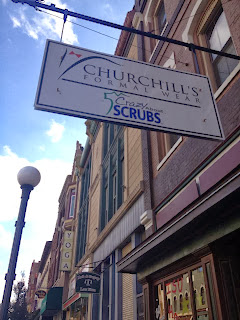
"MANS BEST FRIEND"


This is Churchill's formal wear located in Downtown Bloomington.  There were two major windows.  One window was just of a huge painting of a man in a tuxedo with his dog.  I actually liked that it was a painting and the color of the dog matched the mans tuxedo.  However, the other side was all wrong.  Don't get me wrong go Redbirds!...however, the signage is blocking the merchandise!! Everything looks cluttery and unprofessional, when men's suits should make you feel the opposite.  A man wearing a suit wants to feel fresh, clean cut, and professional.  This window is displaying the opposite.  They also put a hanger on a children tuxedo jacket and stuck it to the wall....awkward.  Overall, this window was just okay for me.  I would like to see a more sharp and updated appearance.

"BEHIND THE GLASS"


This is a fine art gallery and studio in Downtown Bloomington.   I liked these window displays a lot because I literally wanted to get a closer look of what is "behind the glass." (signage)  One of the displays made me feel like I was actually in an artists room where all the magic happens!  It brought me into the lifestyle of an artist and showed me there inspirations.  I really liked the drapes and the lighting in the window.  The colors and items made me feel like I was in my grandmothers attic where I can find the most unique and antique items.  I also liked the huge canvas in the other window.  They did not hang the canvas on a wall, they put it on an easel to give you an artistic vibe.  The green vines laying on the floor and hanging form the ceiling added to the feeling on the canvas and made it come alive.  This fine art gallery and studio definitely caught my attention and portrayed an artistic and inspiring lifestyle.  If you are into art, this is the place to go!

"SIMPLI GIGI"


Gigi Bottega is located in Downtown Bloomington.   Usually I would say "the simpler the better".....however, not in this case.  The window display certainly does not showcase how cute the clothes are in this store.  The décor is way too simple, and the clothing they decided to merchandise did not catch my eye and make me want to shop there.  This was a little bit disappointing to me because the inside is actually a whole lot cuter! There is an awkward huge black divider on this big window.   To make this more balanced and symmetrical it would be nice if they had two mannequins on each side of the black divider.  Certain angles the black divider covers up the middle mannequin completely.  If there was two on each side and not one placed so much in the middle this problem would not occur.  There was no signage, no color, and it gave the cute store a bad look.  The pumpkins were white as were the ugly tile on the floor.  The wall on the side was plain white, as to the drapes.  All in all this window display was not properly made and gives this store a bad look.